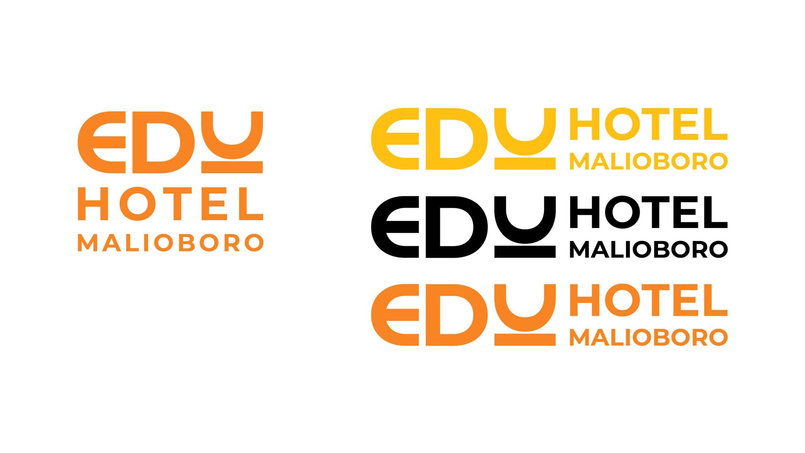
Edu Hotel Malioboro is a hospitality brand located near Yogyakarta’s famous Malioboro district. The brand identity focuses on clarity, accessibility, and a friendly visual tone that reflects the hotel’s role as a practical accommodation for travelers, students, and groups.
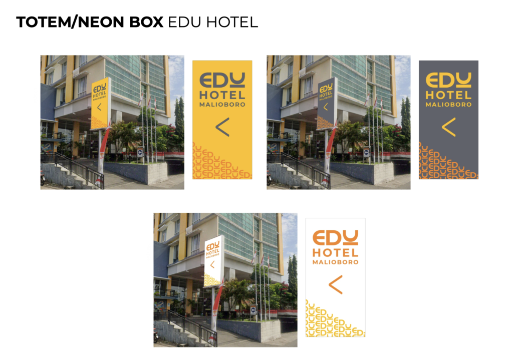
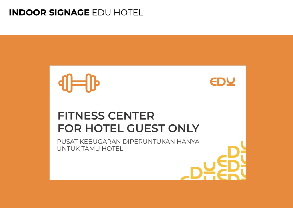
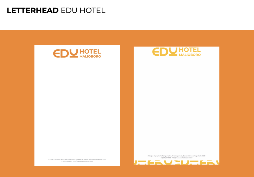
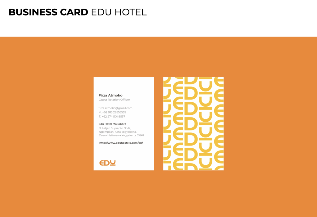
The visual system includes a typographic logo, structured color palette, icon set, and signage applications for both indoor and outdoor environments. The consistent use of bright orange tones helps ensure high visibility and enhances guest wayfinding throughout the hotel.
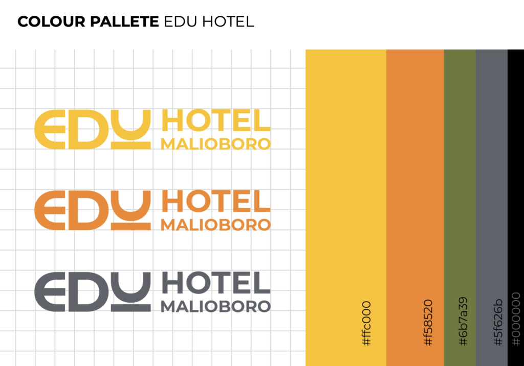
The primary palette consists of warm hues dominated by orange (#ffc000 and #f55f20), supported by olive, grey, and dark charcoal tones as displayed in the colour palette section. The palette enables strong visibility and enhances wayfinding readability across physical environments.
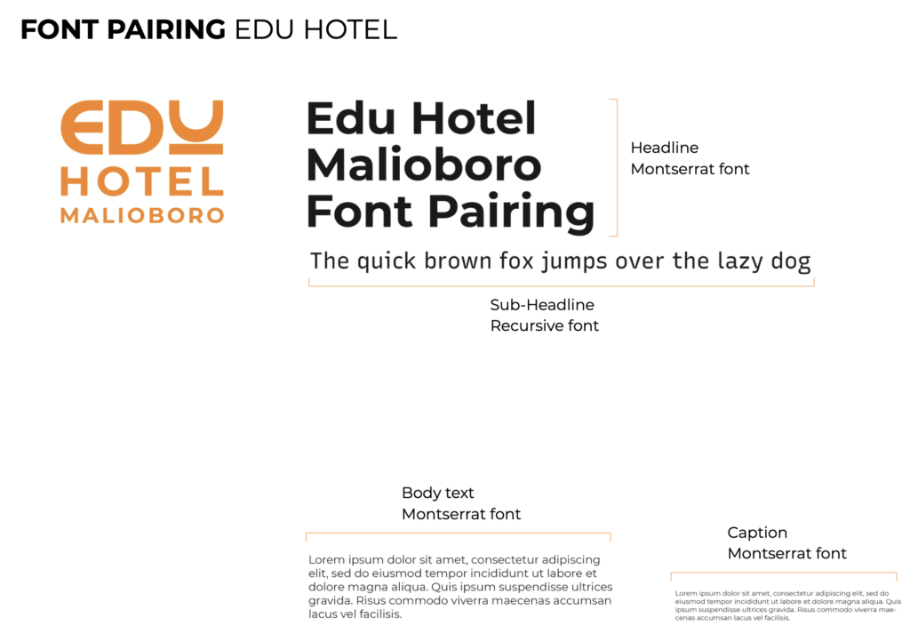
The guideline adopts Montserrat as the primary typeface for headlines, body text, and captions, with Recursive applied for sub-headlines based on the typographic framework. This ensures visual hierarchy while maintaining simplicity.
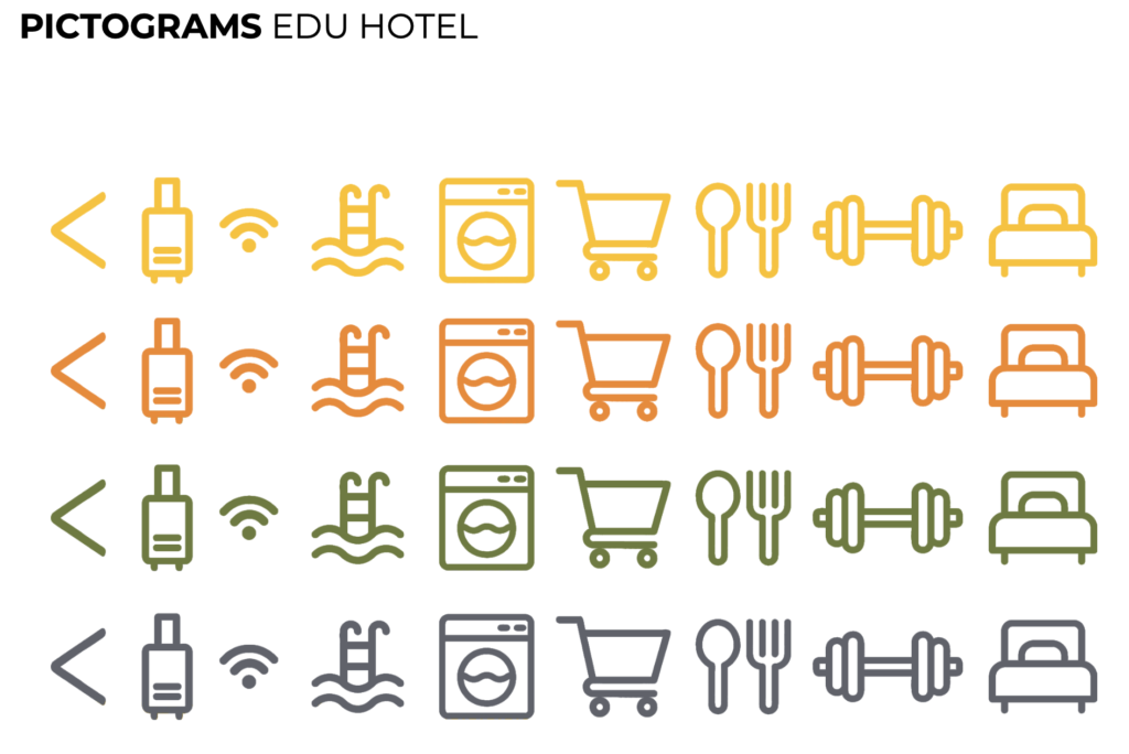
Iconography is introduced to support wayfinding and facility communication, including icons for Wi-Fi, gym, pool, laundry, and more, The icons follow a consistent stroke style and color gradient logic.
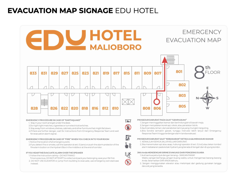
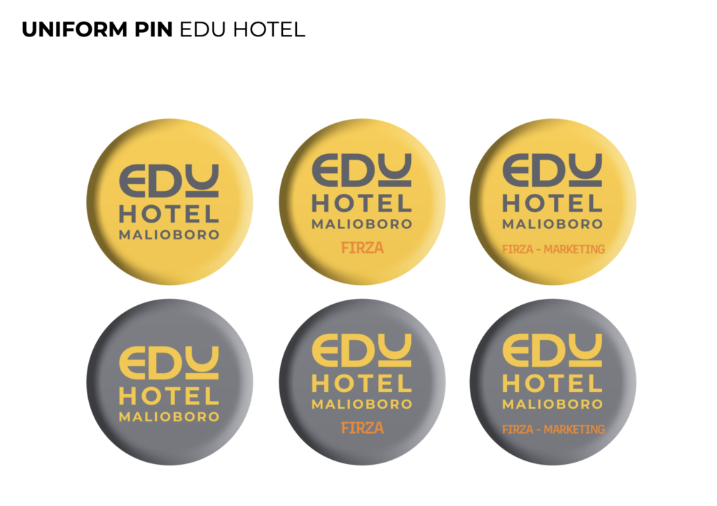
The visual identity expands into multiple real-world applications: